

Books with white pages don’t emit light, a screen with white backgrounds does
It’s like staring into a lamp.
deleted by creator
I like to think of it as staring into a fire
I just put the brightness down
The sun at dusk will still burn your eyes.
I beg to differ 😎
Ask Trump about that, he knows better.
Checkmate libtard! (sorry)
Stare into the lamp and it’ll stare back
Edit: also, u crazy, its just a lamp! —Ikea guy
Yep. And a soft, warm desk lamp is a lot easier in a dark room that a bright white one.
I’ve been reading a dark mode book on an OLED screen and it’s such a treat. The background is pitch black but I crank the brightness up so there is a high contrast and the white letters look really sharp. It actually makes it easier to read
Unless it’s an e-ink screen… then, it doesn’t emit light
And these also don’t need a dark mode.
They don’t… But the option is still there if you want an emo-ink display
When you put it that way… Yes, yes I do.
I use my e-reader’s dark mode when I am reading in the dark and the backlight is on. So, in the one instance where it is actually emitting light.
Even with the “backlight” it’s far less harsh than an LCD or OLED panel because it’s not actually a back light, e-ink display have a “frontlight” that actually directs the light back at the display instead of from behind it facing outward towards the user
FYI ereaders don’t emit light even with the light on. They use lights hidden on the sides under the bezels, and that light gets distributed above the screen using a kind of gel layer. The screen then reflects that light back.
Isn’t the device emitting light though, if not the screen itself? I don’t know if there is a technical definition of “emit” that is narrower, but I just meant that there is one time where the device itself is the brightest thing in the room and dark mode reduces that.
Yeah I guess that’s fair, but I think that the fact that the light isn’t directly shining in your eyes but is reflected, makes quite a difference. Still, use whatever mode feels most comfortable to you! Just sharing knowledge.
They do reflect it, though…
As someone with sensory issues, absolutely they do. I used to struggle so hard in school when I was supposed to stare at white paper in a well-lit room. I’m not sure if most people notice just how fucking bright paper can be xD
Yeah for whatever reason, textbook paper always has a glossy finish to it. Combine that with bright overhead fluorescent lights in a school and I could see how that could be irritating as fuck.
Other types of written material don’t seem to have a glossy sheen like works of fiction and dictionaries. Do you still have issues with those or no?
I’m with you. I’ve been using invert colors before dark mode became cool. If only I could do it in real life…
That’s it, downvote the guy even though he is right: https://www.pa.uky.edu/~sciworks/light/preview/color4aa.htm#:~:text=White objects look white because,wavelengths%3B the rest they absorb.
deleted by creator
Im waiting for someone to argue something about shrapnel vs clean wounds.
deleted by creator
Depends, if I’m being executed I’d rather have the direct fire
Smh. There were two options, and flamethrower was not one of them /s
Not with that attitude.
Plus doing dark mode with a physical book requires a crap ton of ink - it would be very wasteful.
Everything refects lights, that’s how our eyes see!
emit ≠ reflect
I think the point is that reflecting is ultimately just a form of emitting
it’s possible to have harsh brightly lit white paper, as well as dim white screens
White paper and black text is the norm because until relatively recently, it was much more cost effective… This could be done cheaply with modern tech, and should 100% be a thing…
I’d buy the hell out of dark mode books.
That question was just as stupid as that “you wouldn’t download a car” ad. Hell yeah, I would! And read dark mode books!
At this point I can’t even remember what was actually in that ad and what was in the IT Crowd bit and memes making fun of it.
Its context was that it was a plea from media companies to stop pirating movies/music. Its more “You wouldn’t steal a car, well downloading pirated content is the same”
Ot played during movie previews
I was in college for Computer Science when these ads must have just started because in a Computer Ethics class, I remember the teacher actually using “you wouldn’t download a car, would you” argument.
I recall answering… “Would the original owner still have their copy? Yes? Then yes, yes I would download a car.” The teacher did not like me.
Pedantic as hell but justified, I like you.
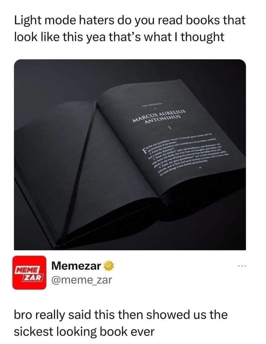
The image is from this website: https://www.monochromebooks.com
Limited edition of 999 hand-numbered copies
But I want it!
deleted by creator
Bleaching is to mainly remove tannins, to make the paper white, and to stay white over time. It also makes the paper better able to absorb and retain ink. You don’t need any of those properties if you’re printing in white, because you can’t use absorbent type ink in something like this, it won’t show well. You could dye in lieu of bleaching (and this might be cheaper actually).
Printing the text is the challenge. The ink has to be on the paper instead of in the paper… The methods required to do that and come up with a quality product have existed for a very long time, but they’d be methods used to create high end things like wedding invitations and greeting cards and not bulk products like books. I believe the first tech that could do this economically at scale was the photocopier (maybe mimeograph?), which basically melts plastic onto the surface, and could apply clear white text onto black paper as easily as black on white.
I would imagine though, that the tech that could do this in the most economically viable way, would be to ablate the text in with lasers, similar to thermal printing. That would actually reduce the consumables used, maybe even by a lot. likely would overall entail much less hazardous/caustic consumables too… Dark mode printing could possibly be incredibly “green” :)
Buy an ebook reader and you can do it today.
Books don’t light up. They reflect light, but it’s different. Light mode is like staring into a flashlight, almost literally.
I prefer light mode in light environments and dark mode in dark environments. I find it’s easiest on my eyes when the background of the text matches the room ambience. (of course this has to be paired with matching screen brightness)
Yeah, light mode is great for when you’re outdoors.
Only then.
And on a beamer.
It’s called orbiting a star, and even then it’s only when you’re facing the star
“On a beamer” Nobody calls them beakers around here. For me it’s always been “star”
I don’t get what you’re trying to say.
Could you please enlighten me?
Poor contrast is what kills your eyes. You should adapt your screen to your environment.
Problem is, not many screens can compete with the of light of a sunlit room for daytime viewing. That makes dark (text) on dim (background) on light (environment) very rough. Even for daytime viewing light (text) on dark (background) on light (environment) can feel better.
But dark (text) on (light) background on light (environment) is excellent if you can accomplish it, since it’s only single step of high contrast because your monitor blends into the environment.
However I bet you could make a book with ink that glowed.
Remember that in the beginning of computer era there was no dark mode, it was just called a display:
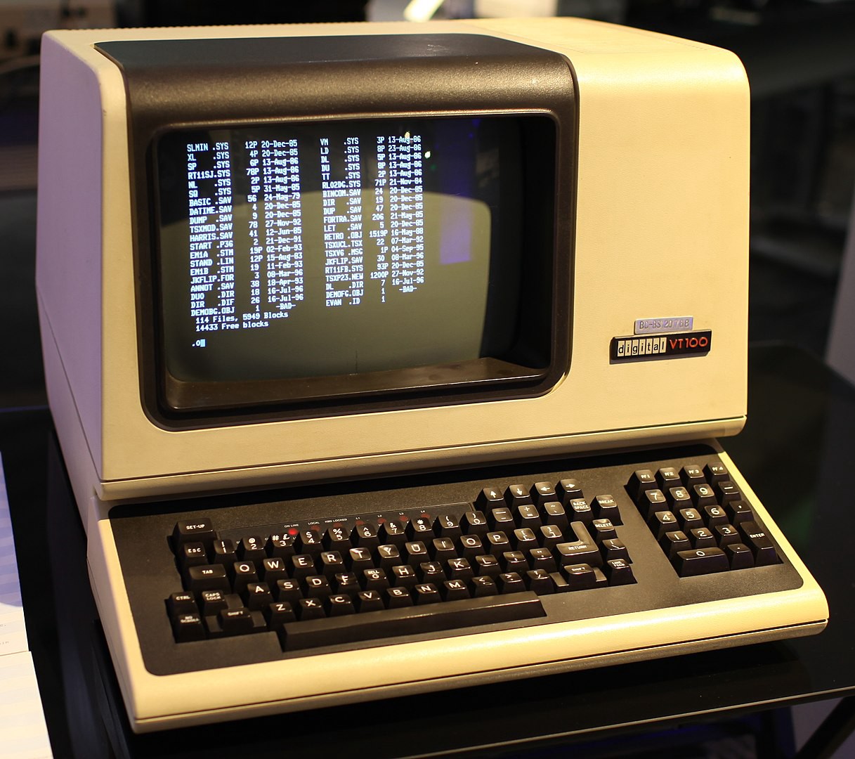
Heyyyy! I have one of those. Still works. https://imgur.com/gallery/0GVWgMQ
To really prove it you should type your username on it.
That thing is awesome!
“cumputer” Hmmm… I’m not sure if that’s just misspelled, or some clever reference that I’ve missed.
Just typo. But certanly is funny one.
Pepperidge Farm remembers
I mean if I could I would. Also books do not emit light that burns my retinas so… moot point
Fun fact: kindle has a dark mode
Most ereaders have I reckon as it’s rather easy to implement. My Tolino/Kobo also does, although, I don’t really see the point with e-ink displays
Pocketbook very recently added it. But most importantly koreader has it (an open source reader app that is available for a lot of devices), so I basically had it before (excluding system menus which was annoying).
Glow in the dark eInk would be dope for this.
I use it exclusively 😅
Books use the color scheme they do because it’s cheaper to print black ink on white paper than white ink on black paper. Digital displays don’t have that limitation.
Except OLED. It’s better for OLED to show white text on black background.
Every software needs a “just turn off the pixels that aren’t displaying anything” mode for OLED. Way too many “dark modes” are just dark grey which still keeps the background pixels powered.
Yes, because full black/white contrast is harsher on the eyes than a dark grey with white or light-grey text. For power/efficiency, black pixels definitely makes sense, but concerning user experience and eye strain, there are many good reasons certain color palettes are used.
Obviously not every single OLED panel can be tested for this if the manufacturers don’t do it themselves, but a few places tested OLED/AMOLED phones and found slate grey is close enough to full black in power savings. Since then I just choose the most visually pleasing theme as some full black themes are really poorly designed.
Fair enough, a choice between both options is always better.
It’s usually referred to as “OLED Dark mode”. Discord has it for an example
Is it though? Wouldn’t that cause a burn in faster?
No because the white parts are what will burn in. Black is the off state for OLED. This is also why many apps for Lemmy (and previously reddit) have a dark theme option for OLED devices that uses full black instead of grey so that the pixels not in use are fully off.
Exactly, and because the rest is off you’ll notice it earlier. It still depends on how long those pixels are on though. The longer they’re on the more they degrade.
If the whole display is on all of the pixels would degrade eventually, but you’ll notice it less because they all degrade.
If you have the same pixels on all the time then yes you’d have faster burn in. However, since you’d be looking at different text, this degradation would be spread over the different pixels. Not uniformly, but good enough that it doesn’t matter for practical usage.
How about we really break the bank and just print an entire black page on white paper.
In all seriousness that’s not usable because the ink will have a tendency to bleed and fill the voids that make up the letters.
Explain eink screens
deleted by creator
E-ink actually doesn’t as it only uses power when pixels change between black and white and not when it’s displaying a static image. E-ink uses the same amount of power rendering white text on black as black text on white. However, white text is more common since e-ink is specifically meant to imitate printed pages, and assuming it’s not backlit, also doesn’t have nearly as bad eye strain issues when in light mode as a glowing screen does.
It only has to update the parts where the words changed and it only uses the energy to initially change the screen. It literally uses more energy doing full screen wipes (flashing between black and white three or four times) to avoid ghost images. It would significantly reduce the need for a refresh if it was mostly black.
Our eyes are more sensitive to variations in lighter colors after all.
Imagine the cost of all that black ink.
Black paper and white ink.
But how do you make the paper black
Blackwood duh?
I laughed so much at this. Thanks buddy from the internets
Black dye. Really not too bad when you consider that to make paper white it’s literally bleached white.
We make it white now? The magic of chemicals and dyes.
Most books I read are not white, they are more yellowish, so I think they are less dyed and more natural
That’s pulp fiction for you.
deleted by creator
Oh, I thought bleach was a chemical. My bad.
Lmfao
Yall ain’t ready for Bible 2.0: Back in Black
we already have bible black
Lol seriously though, I’ve had so many people look at my phone and are like “JESUS YOU USE LIGHT MODE”
Like it fucking matters what I use lol
There’s a comp sci student I try to help but his entire ide is in light mode. He uses a macbook with full brightness on and it physically hurts my eyes. I use a Thinkpad with half brightness, night mode on, and dark mode everything.
Maybe his eyes are bad. I have astigmatism and especially the combination light text on dark background at low brightness is hard to read for me, because the letters “bleed out” (think like streetlights through a foggy window).
Interesting, I have minor astigmatism and have the opposite problem, a light background blurs the text for me while a dark background and white text is nice and crisp for me.
Maybe astigmatism can have different orientations, it’s a wrongly shaped lense, after all. And there are many false shapes for that.
Astigmatism definitely has different orientations (a 360 degree angle figure) but it affects the direction the blurriness goes. Not the amount of it.
I also have it but not super bad. For me it’s still much better to have a little blurriness at night than burning my eyes out on a white background (thanks google for popularising the “white on light grey on white” design mantra)
They can and do. That’s what the optometrist is checking when they flip the little lenses around and rotate them and it’s obvious it wasn’t to change the focus. It doesn’t get more/less clear unless you have astigmatism when they’re flipping those ones (at least in the same way).
I’ve liked light mode on a few things in the past, but dark mode feels so much easier on the eyes.
Yes but people say this to me about my phone
Could this be me…?
That’s me: I use a MBP, light mode (#ffffff) everything + Lunar for “overdriving” the XDR display brightness. Dunno why but I like it
This is why I don’t care for monitor and tv reviews. The reviewers are like “you guys this shit has 2000 nits peak brightness!” and I’m just over here thinking that I wouldn’t use even a 5th of that peak.
JESUS YOU USE LIGHT MODE
Yes, my child.
From an objective point of view, if your phone has an OLED screen, it uses less energy to emit less light. So in that case, dark mode can matter in that it’ll save battery life.
That said, I’m seeing a lot of aesthetical defense.
It also makes it harder to read the screen when its bright outside
How would dark mode fans know what’s it like outside
Alternatively, just find some frickin shade.
Why would I look for shade when I can see my screen on light mode just fine
How many puppy stragglings are you up to this year, buddy?
Not all dark modes are created equal. Some dark modes use a color theme that is illegible for people with color blindness. Many dark modes don’t have enough contrast for the legally blind. Now, properly well designed dark themes with accessibility in mind will be more readable. But for some people with certain forms of blindness, black letters over white are more readable than what some apps and webpages implement as a dark mode.
That’s fascinating! Where can I learn more about this?
Not OP, but if you want to peek at what the law considers decent design for this stuff, look up WCAG and AMA requirements on contrast. Not only will you have a better idea of what’s legible for folks, but you’ll be able to tell when a business or website isn’t following accessibility laws (they only HAVE to follow them if they’re government related sites or public services though, iirc)!
Thank you so much! I’ve astigmatism, and dark mode is definitely more easy to read, for me!
Automatic dark mode/night shift is the way to go, change my mind.
I only like dark themes, but on a phone they suck in the sun, so from time to time I switch it up just to see.
I can’t handle dark mode on most screens especially in daytime. It strains my eyes trying to read light text in dark background, even more so when there’s ambient light. I prefer a solarised light mode for IDEs, with anything else I make do. I’ve spent hours trying to find a usable dark theme for VS Code, and I’ve always ended up going back to light.
It depends on the context, but I often prefer light mode with screen brightness set to very low. Easy on the eyes. Never experience the shock of going from a dark page to a bright page. Bonus is that battery is rarely an issue for me (usually 80% remaining on normal days).
I have a theory that people who complain about light mode haven’t figured it’s possible to just reduce the screen brightness.
I like bright white text on a black background
Imagine reading black text on white background, but the background emits light.
I WANTS BOOKS LIKE THAT!!!
Can I have 1984 is all dark pages?
Dune, Handmaid’s Tale, Silmarillion, so many books would look epic like this.
The Gallic wars by Julius Caesar would also be great with it.
I would pay double the hard cover cost for a book like this
Kindle e-readers come with a night mode, which I use regularly and it doesn’t look too different from this. Very useful when reading at night next to your partner
Came here to say the same thing. We use it nightly.
I’m try ing to put the internet down, to pick up the Kindle now, in dark mode
Damn. This is effective advertising if it is. I ended up googling it. This book costs $90 :(
deleted by creator
deleted by creator
Someone got pay for all that black ink
“It’s about sending a message…”
I would read that book. I also would download a car. The thing stopping me is the possibility.


