
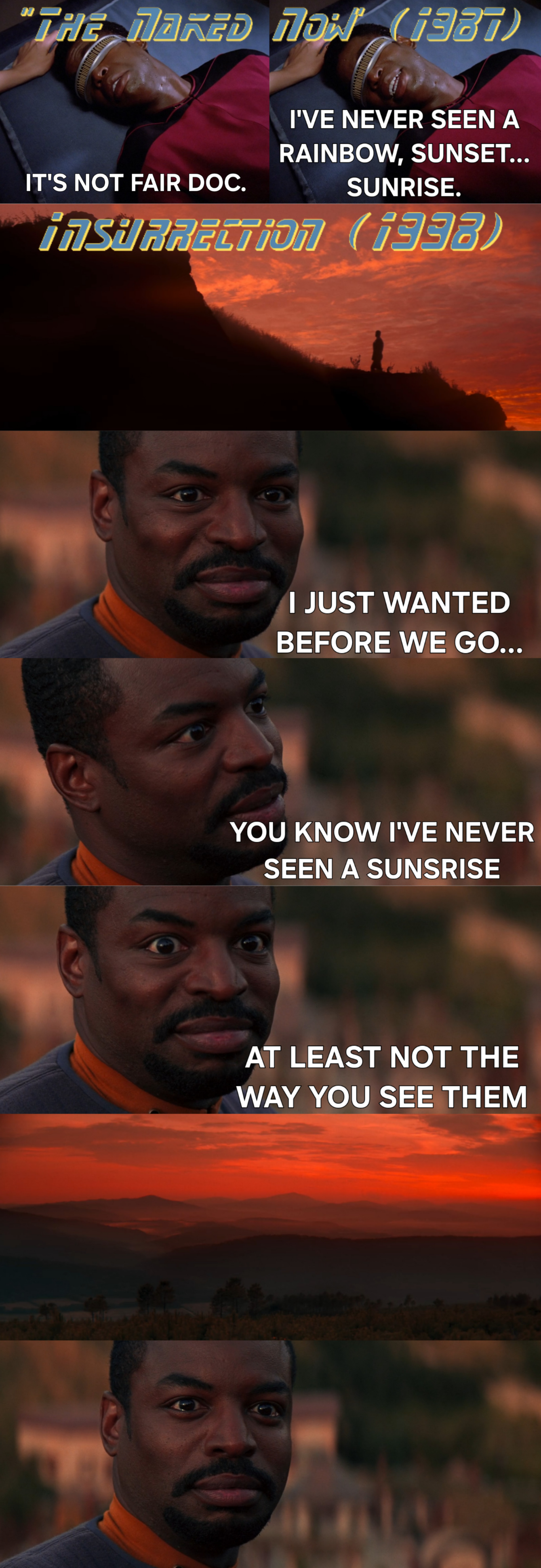
Just rewatched “The Naked Now” not having seen it for at least a decade. Forgot about the talk with Crusher about his condition and how they bring it full circle when the metaphasic radiation temporarily heals his optic nerves. I’ll be funny next post, I swear.
Can we discuss how in that font 9 looks like 3 because they consistently cut a line through the beginning of each character but somehow S gets a special exception because…?
i3δT
and
i33δ
Never really noticed that before. When you don’t focus on the letters they are easier to read.
Oh man thank you. I wasn’t getting it because my knowledge of Star Trek isn’t that complete amd I was trying to figure out if this was a plot hole between i387 and i338, which I guess are actually 1387 and 1398.
I think the S being at the beginning of Star gives a sense of containment, followed by the through line that mimics the warp trail. Generally, I prefer the credits font as it’s more consistent and legible.
You can’t see it, but the top of the S curve actually comes forward, too. So when the letters all got sliced, it was unharmed.