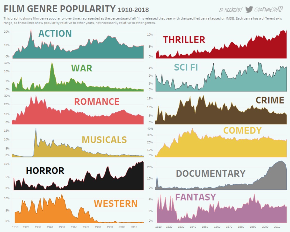
Depends on the goal of the visualization. This is an excellent choice if the goal is to show relative popularity changes over time, not absolute popularity relative to each other.
That said, the y-axes should be more prominent to draw readers’ attention to the differing scales to decrease the chance this graph is misread.
It’s also not explicitly stated that movies can be tagged with more than one genre, but, eyeballing the numbers, I’m pretty sure that must be the case.

Cool but awful design, why is every graph in a different scale
So that you can compare the relative changes over the years without having a tiny line for less popular genres.
It actually tells you right below the title why they’ve chosen to do that
Depends on the goal of the visualization. This is an excellent choice if the goal is to show relative popularity changes over time, not absolute popularity relative to each other.
That said, the y-axes should be more prominent to draw readers’ attention to the differing scales to decrease the chance this graph is misread.
It’s also not explicitly stated that movies can be tagged with more than one genre, but, eyeballing the numbers, I’m pretty sure that must be the case.