

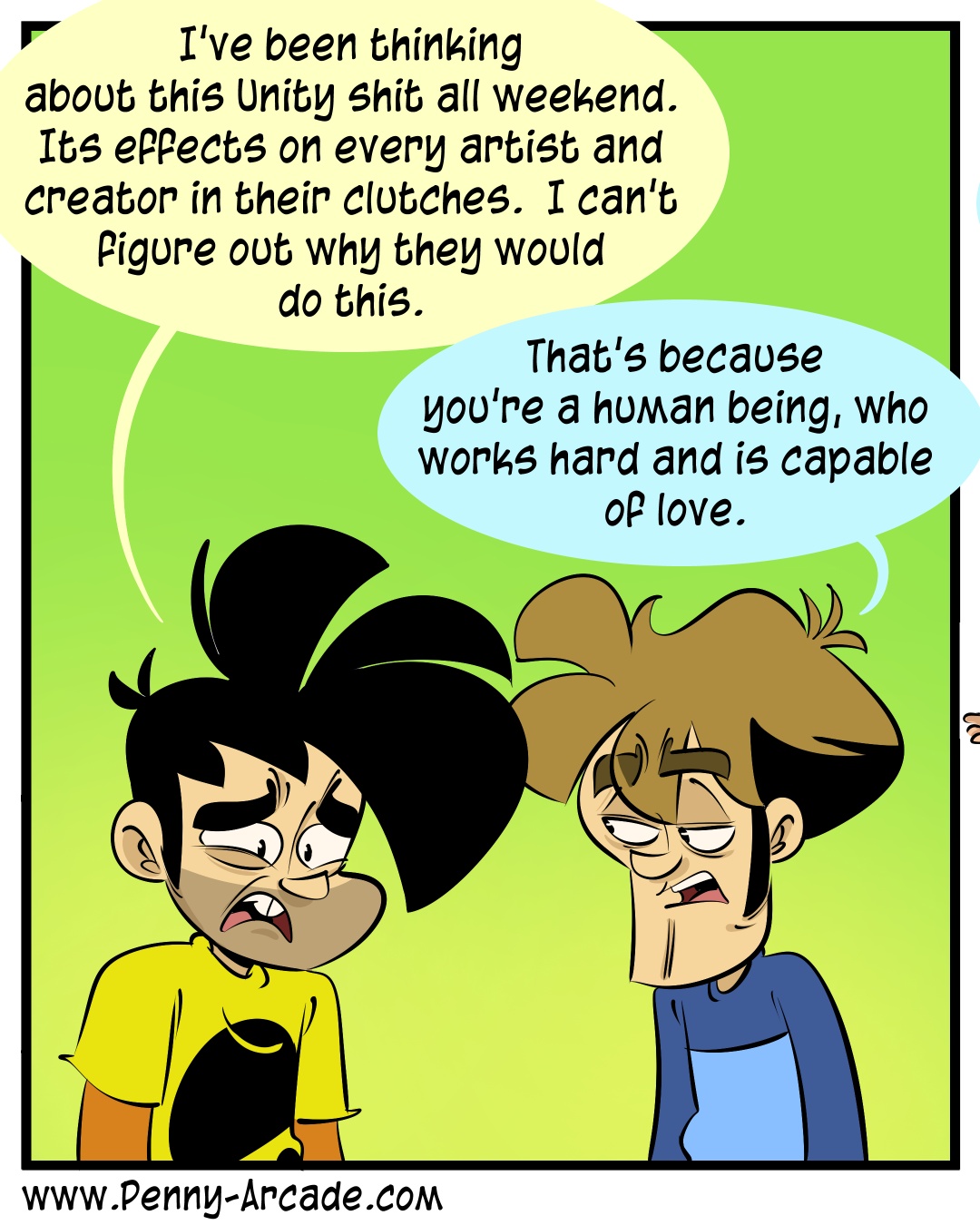
Today’s Penny Arcade is a near perfect commentary on the Unity debacle.
Whole comic linked above, but here’s the one-panel that is perfect.
Today’s Penny Arcade is a near perfect commentary on the Unity debacle.
Whole comic linked above, but here’s the one-panel that is perfect.
I’m so glad I’m not the only one that thinks this! I can see how and why it happened, as the art style became increasingly stylised and exaggerated over the years, but visually it’s really, really not my cup of tea. It feels like what happens when you spend all your time just drawing the same thing over and over (ie, two specific characters) to the point that they become increasingly caricaturised and distorted.
No one else I know dislikes the art, and like… I dunno, it’s a successful and well-loved comic that a lot of people enjoy. I don’t begrudge them that success. It’s just not a visual style that works for me. And it’s kind of nice to know others have noticed the same thing and it’s not just that my perception was completely off.
It feels Ren and Stimpy-tier, no offense meant but just the style of being overly garish without it being quite as warranted
Now you mention it, yeah, it does give me some Ren and Stimpy vibes.
Yeah, it’s better to do dinosaur comic and just don’t change the art at all.