

Voting has ended! Congrats to @fer0n@lemm.ee with option B. Thanks everyone for participating! :)
First off, thanks to everyone that participated in our icon contest last week!
I’m excited to show the final three options for you to vote on below!
Overview
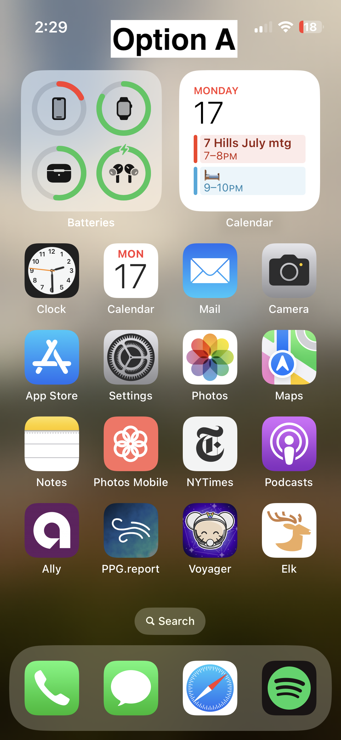
Option A
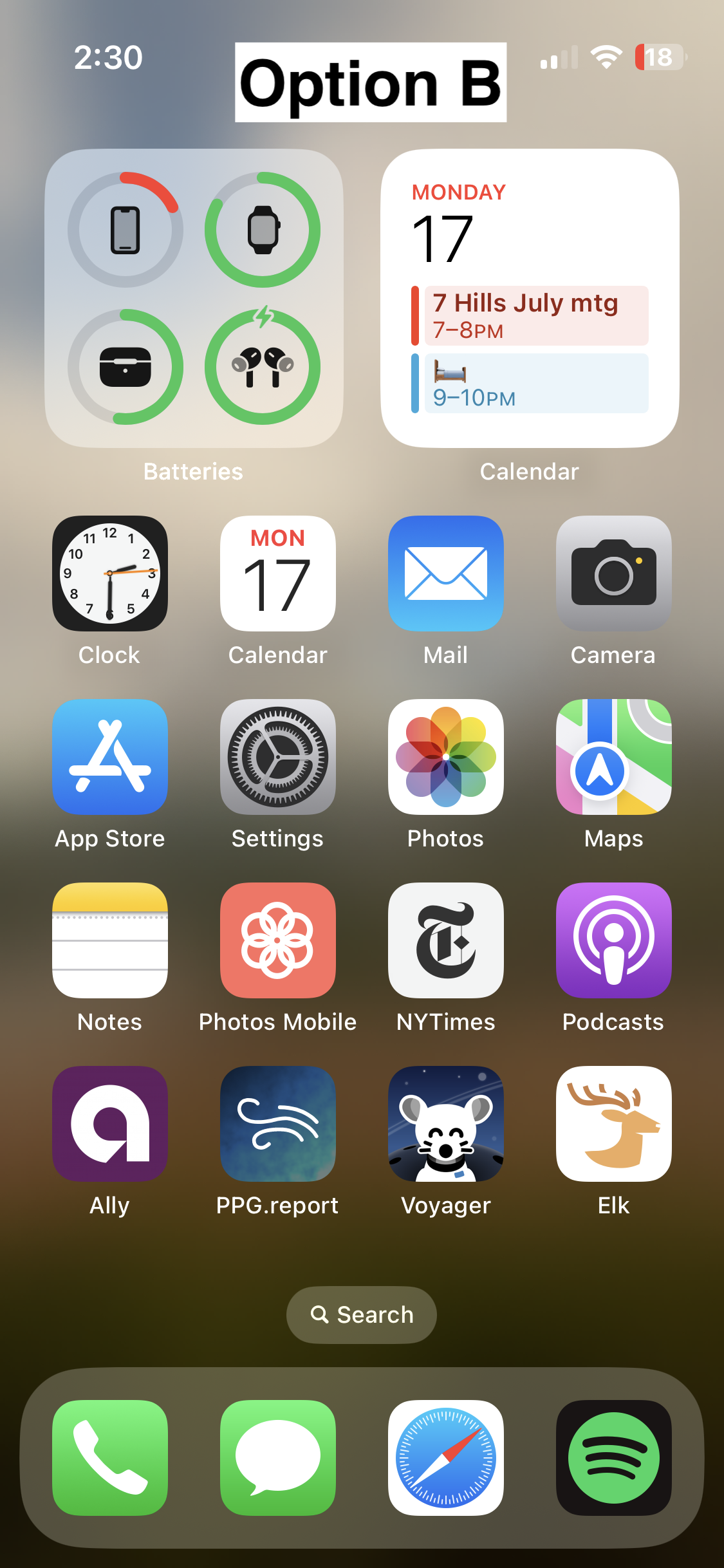
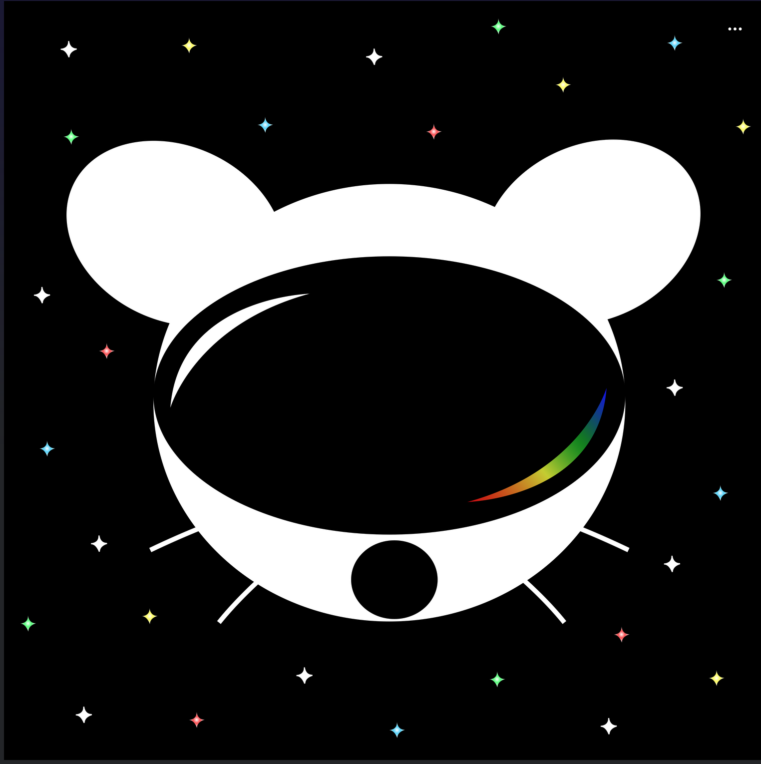
Option B
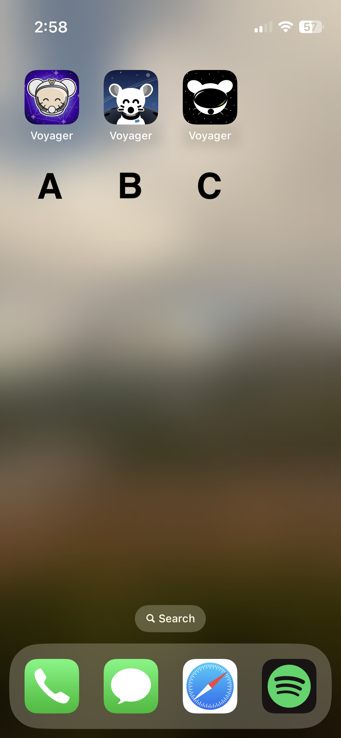
- 📸 On homescreen
- 📸 Icon
- Credit: @fer0n@lemm.ee
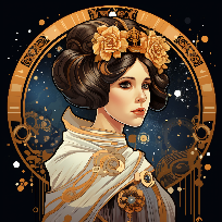
Option C
🗳️ Vote!
⚠️ BEFORE VOTING I encourage you to tap through the links above to see what it’s like on your homescreen!
Results of the poll will not be available until it has ended, so no need to make a rushed decision.
VOTE HERE: https://strawpoll.com/BDyNEbKeqZR
Polling ends in ~24 hours! If there is a tie, I will cast the final vote.
You must log in or register to comment.
I vote for C.
Kinda looks like that apple vr
Yes, though only because Apple just used pretty much a standard ski goggle aesthetic.
C, def.
Same
C all the way
I think B looks the nicest of the three by far. Good use of a monochromatic color scheme, nice balance between background and foreground elements, perfectly readable at a distance.
The design direction of A is a bit busy and stands out a little too much IMO, it looks kind of out of place next to stock iOS apps. C looks a bit too amateur, and has several tangents in it that really bother me - I do like the overall idea of it, but it could really use a rework.
If one is chosen, I’ll give the author the opportunity to tweak :)
Good to know! :)
I started with C, but then clicked the links to compare what hey all looked like on a Home Screen (yes, I eventually followed instructions … look at me go). B is clearly the standout for me.
deleted by creator
My vote is for B, but I think it would look good with a splash of the multicolor like the other two do.
I like the lack of multicolor for an icon. I also liked the ability to change icons in Apollo if I was feeling colorful during that period of my life.
If you’re on iOS, here‘s a shortcut that lets you change the icon to whatever you want.
This is the post about it.
None of the above. They look straight outta 2010.
It pains me to agree, since the community put so much effort into these, and that’s truly appreciated, but I don’t feel like any of them live up to Voyager’s aesthetic. They’re all kinda amateurish. Hopefully the devs do another one of these contests in time.
That’s the word I was trying to avoid, “amateurish” (not to sound harsh). There are a lot of cool ideas out there, but definitely not the work of a professional designer (disc.: I work with graphic designers and app developers, I’m a web developer myself). Maybe the Lemmy community needs to grow a little, so we can get more options.
I also think the contest guidelines are partly to blame. The whole, “avoid the corporate vector look, look at these super detailed illustrations” thing is horrendous advice. It basically translates to, “avoid doing what the most talented app icon designers in the world do.”
Yes, the icon should be fun and stand out. Yes, the Facebook “f” is boring as fuck. But some of the greatest app icons are extremely simple, and there are reasons for that. Fine details don’t display well in the actual contexts that icons are used in; they make the design seem muddy and confused. People resonate with clear design that knows its purpose.
IMO you just hit the nail on its head: it’s an icon not a miniature fanart, it can be simple, yet creative, original and most important, easily recognizable, less is more. These options look like Apollo knockoffs.
I prefer the current icon to any of these new ones.
Looks like I can never delete the current one from my homescreen for any reason 😅
I agree. All 3 options look outdated and are not good icons for a Home Screen. Icons need to be simple and clean, these are all too busy
I honestly can’t stand the cutesy eyes. I wish there was some more diversity in the options, something more abstract in there would be nice.
Oh well, through the magic of Android I can pick a different one to use from the thread.
deleted by creator
The probe is <3
Sad to not see it as an option to vote on!
Holy shit lmao these are actually good, the difference is astounding
I hate to say it but the options are a bit disappointing. I wish the top community upvoted submission was considered:
I though C was the top one, but you’re right. One of the two there should’ve been up there, they look great.
I like B personally, but the choices aren’t adaptable icons on Android 🥲 if anyone knows a good way of forcing that on Nova launcher let me know
What do you want them to do?
Change color based on Material You.
Does it have to be a svg version or what does it need?
Add me to the “unfortunately I don’t think any of them are great and can’t/won’t single out one to vote for, but truly appreciate all the effort that’s been put in” list
This is what I thought too. The original icon is better then the given 3 options. Sorry about all the effort from the contestants.
I’m going with C. A is pretty cute too though.
The current one is way better than any of these. No offense to the designers they look great but I just don’t think they beat out what’s already there.
I think C is the cleanest
I don’t really get what’s going on with C, it seems like it’s the Lemmy logo wearing a VR headset.
I like B the most.
C isn’t bad. Give it the smiling eyes in white and it’ll probably be better.
A is too busy.
👁️ 👁️ https://i.ibb.co/Hr1bDGr/eyes.png (sorry😅)
Lmao
Lol
My primary vote goes to D - The current icon. My secondary vote would go to C but much more colorful.
Edit: “VPN user voting is not allowed”. Really? We’re afraid someone will use VPN to brigade this icon vote?
It’s a stawpoll thing, just a site-wide ban. Which doesn’t even really work, since I just voted using iCloud Private Relay (a proxy, not quite a VPN but still) and it worked just fine since the servers must not be registered to strawpoll yet.
Yeah I could see C working with some colour inspiration from the current icon perhaps
I like the PWA logo that we already have.
I am in the same boat. I like the current icon just as I liked the previous name. :-)
Me too. Since it’s a PWA on iPhone, I guess we can change the name to whatever we like :)
I’m not voting because none of them look good, sorry :(
C for me


![[WINNER: OPTION B] Choose Voyager's icon!](https://lemmy.world/pictrs/image/5423bb2e-347a-4f42-b303-1c8cfbe09ab6.png)